Being a major foodie, one of the first things I thought of when delving into UX was how I could somehow marry it to one of my favorite hobbies- cooking. I have always loved the idea of discussing my own cooking adventures as well as eats I have had while out and about. While I have a small presence, I am a lover of social media. To focus on my UX skills, I decided to use my existing content and create a food blog around it.
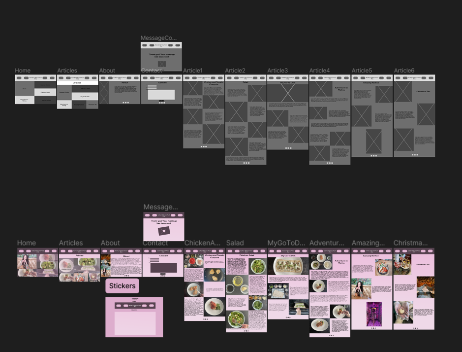
I wrote new, expansive content about my food and outings to include in this project.It was so much fun to think about which dishes I would like to include and discuss. I wanted my blog to have an essence of me. That is why I chose to use pink throughout. Pink and black are two of my favorite colors. I use them frequently in my various projects. I also opted to use my favorite font, Cherry Cream Soda.
The purpose of my project was to create an easy-to-use blog that gives cooking tips, recipes, and some restaurant recommendations. I enjoy looking through local blogs to see what is going on in my area and areas I am willing to road trip to. I made sure that functionality was a big part of my application. I wanted there to be a familiarity with buttons that would seamlessly guide the user. Contrast was checked on the colors to ensure readability.
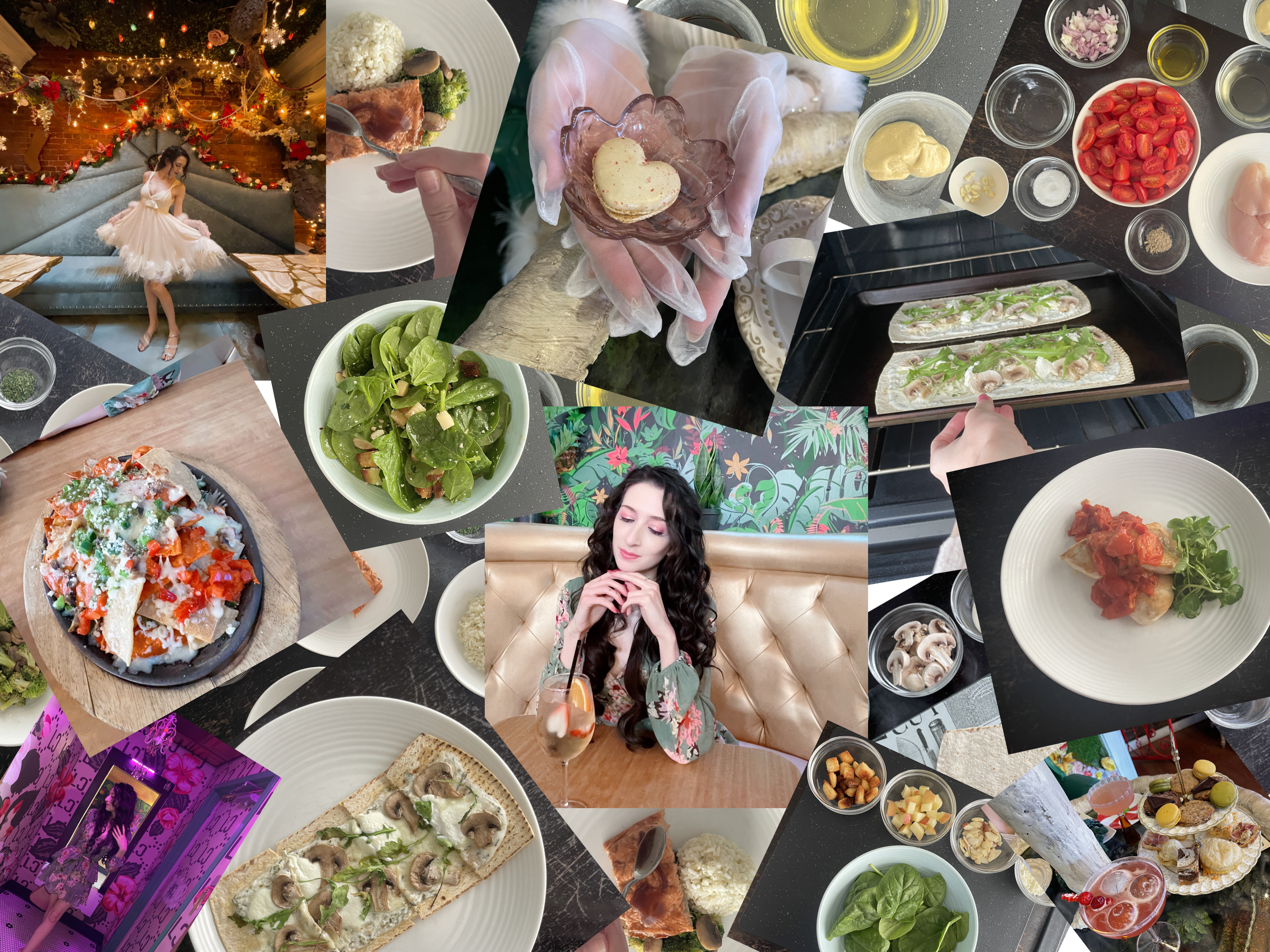
I wanted to create a blog that would give information in regard to food, cooking, and eating out. Pictures I took of my own food to document successful recipes are used throughout . The pictures from outings are from my own adventures in food. The purpose of my blog is to inspire others to go on their own adventures and experiment in their kitchens.
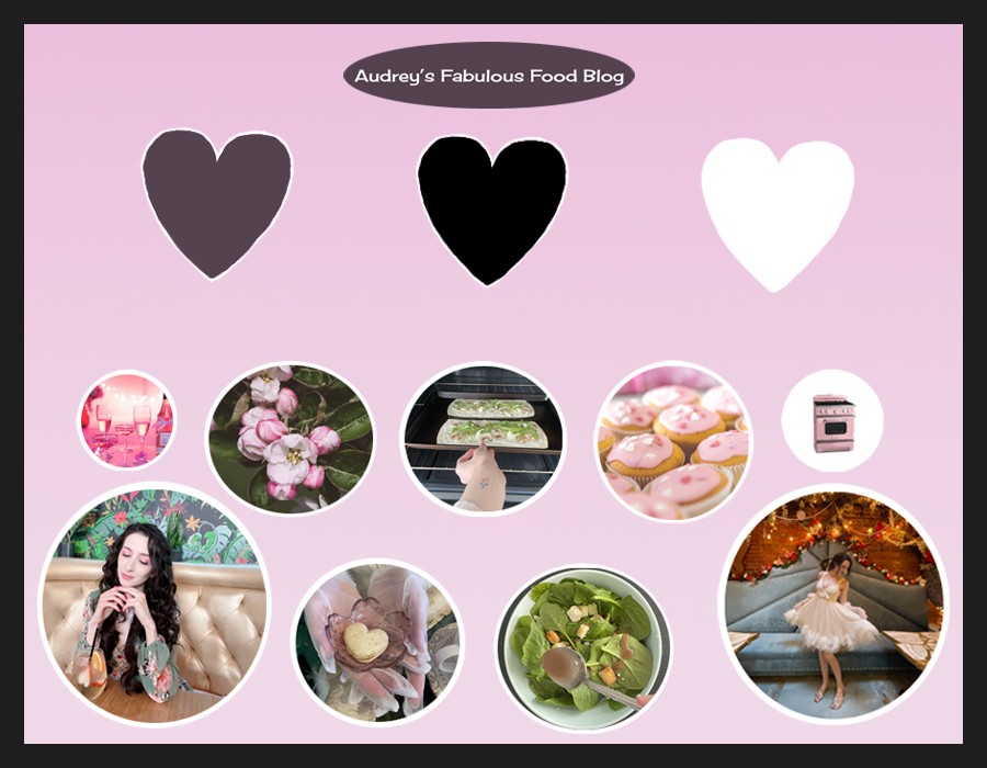
The mood board I've created for my food blog prototype is infused with the warmth and joy that cooking brings into my life. With my favorite color, pink, as the central theme, the mood board radiates a sense of passion and creativity. Images of delectable dishes, from gourmet entrees to decadent desserts, are carefully curated, each capturing the essence of flavor and artistry. Interspersed among the food photos are snapshots from my culinary adventures, showcasing the diverse cuisines and vibrant atmospheres of the restaurants I've explored. Through this visual journey, I aim to inspire others to embrace the joy of cooking and embark on their own adventures.
I researched numerous food and travel blogs to get an idea of what the layouts look like. This gave me some information for what users expect from a blog of this nature. Research helped me decide exactly what kind of content I wanted to use. I was able to take a few new pictures for my project. I noticed some blogs tend to have repetitive patterns in how the content is displayed. While I know this can be very necessary for some projects, I wanted to take the opportunity to experiment with different layouts depending on the dish and how the pictures were best situated.
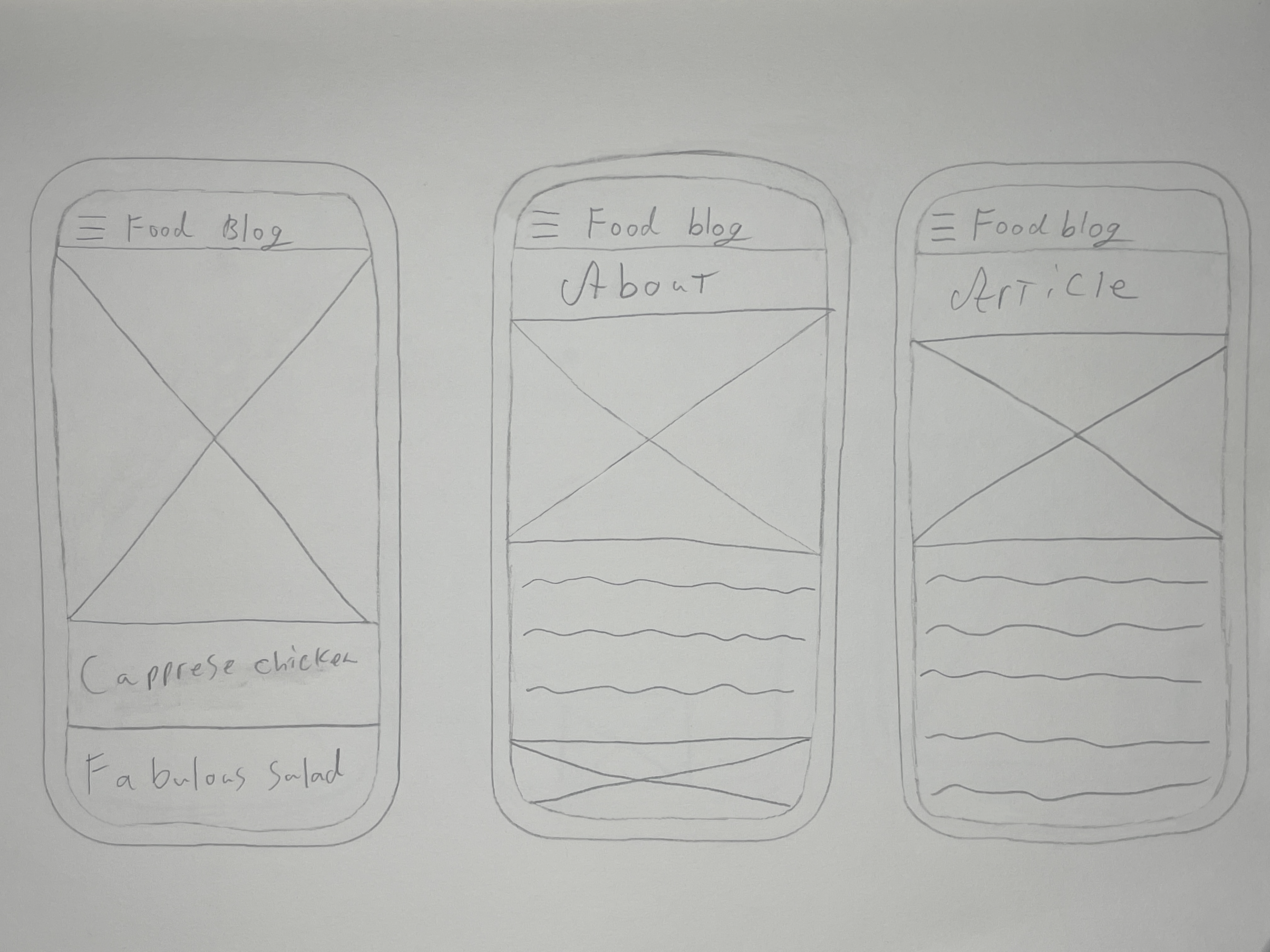
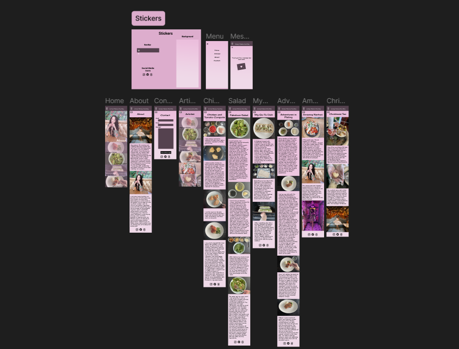
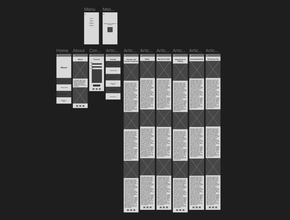
Sketching wireframes is where I started. When I picked my favorite sketches, I decided to make more detailed drawings. I then made some wireframes in Figma to start my project. When I hooked up the wireframes to check if my layout had the functionality I wanted, I started to flesh it out with photos. I had a lot of fun creating new layouts for the desktop version. I wanted to challenge myself creatively by trying out a few new layouts so the placement would not be repetitive.
I also wanted to create this website for desktop. I made sure to include the same elements. The main difference would be I wanted to play with various placements and different layouts for the blog. This was a fun challenge to unleash some creativity on a layout that could have potentially been the same throughout.
Finishing this has motivated me to figure out what the next steps are for me in starting a blog. I plan on working through a cooking course first to make sure I have all information possible. After finishing a few other personnel projects in addition to the course, I will be raring to go on sharing my own recipes and the meals I cook every day.